A reference + prompting guide · v1.0 · 2026

Fifteen distinct web aesthetics, with copy-pasteable prompts.

When you ask an LLM to "design a website," you usually get the same 2018 Linear/Vercel pastiche regardless of brief. The trick to getting actual variety is to specify the style by family + references + concrete visual moves — not by adjective. This is one starting set.

Built by Claude Opus 4.7 Every style has a live example Generated in one session, parallel sub-agents
§ How to use this guide

Read the breakdown, click the example, then paste the prompt.

Each entry has the same shape.

A one-line description. A list of references the style descends from. A list of concrete visual moves (palettes, type, layout, decoration). A list of things to avoid — usually the common AI-default failure modes for that style. A list of subject suggestions that earn the treatment. And, collapsed by default, the full prompt used to generate the live example.

The prompts are opinionated.

They tell the model what *not* to do as much as what to do. That's deliberate — most style failures come from the model collapsing toward its mean. Listing the failure modes by name is the single most effective intervention. To adapt a prompt, swap the subject matter; keep the visual moves and the avoid list intact.

How the examples were built.

Each prompt was passed verbatim to a Claude Opus 4.7 sub-agent in Claude Code with instructions to write a single self-contained .html file. Three at a time, in parallel. The model picked its own subject matter from the suggested list. None of the examples were edited by hand afterward.

What's not in this guide.

Style adjacencies and hybrids — Bauhaus, mid-century, art nouveau, magazine-as-brand, editorial pixel art, anime UI, etc. The fifteen here are deliberately the most-different from each other to give a working spread, not an exhaustive taxonomy. Send PRs.

§ The atlas

Fifteen styles, five families.

Grouped by what they're trying to be. Live links go to the generated example; live markers indicate a working specimen.

01
Editorial & print · Family I

Swiss / Internationalist

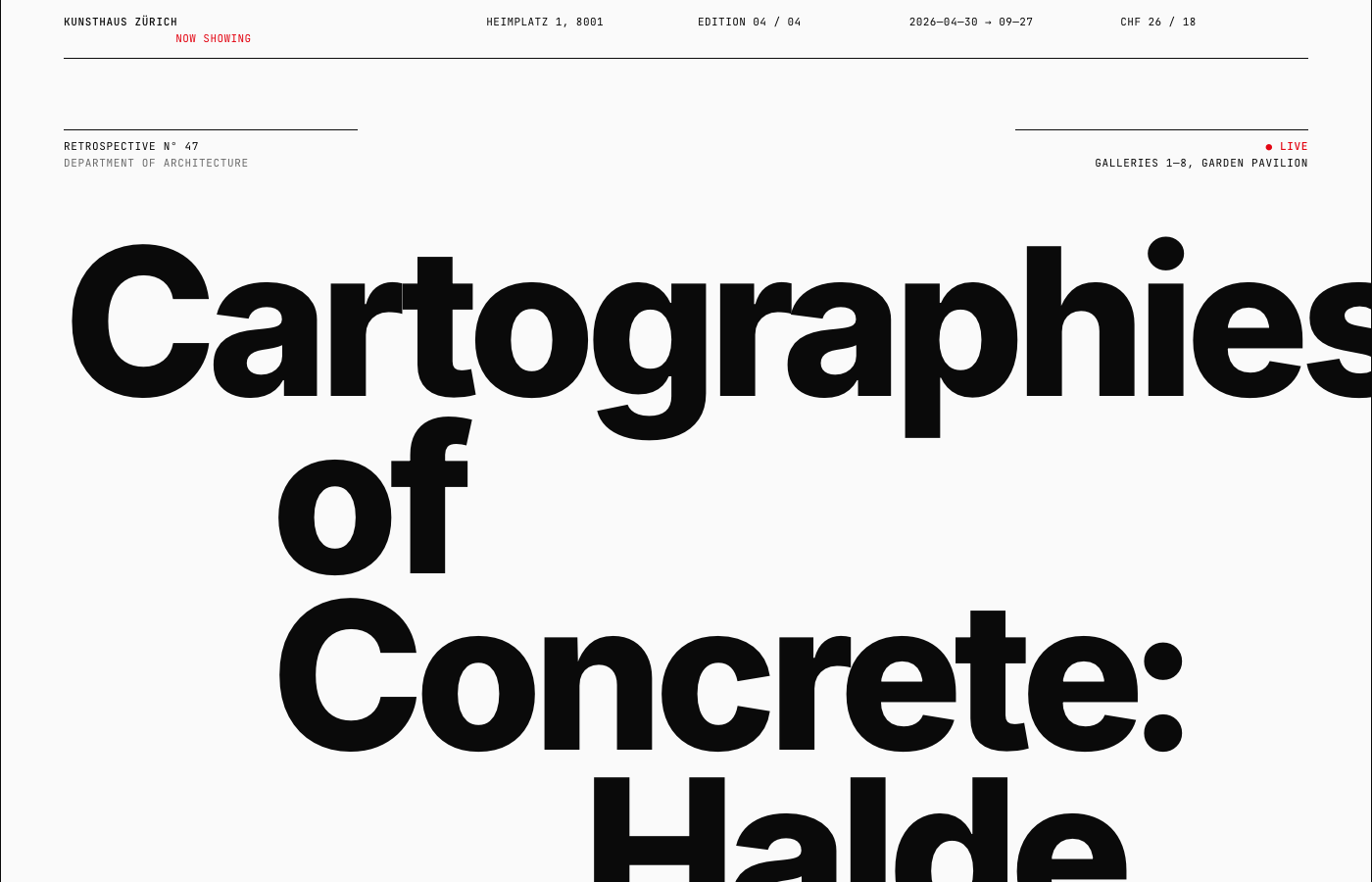
Strict modular grid, asymmetric composition, restrained palette of mostly black on white with one accent (often Swiss red), and confident type sizes that jump from 11px to 200px. Type is the imagery. The visual language of museums, transit systems, classical music, and architectural firms.

References

  • Josef Müller-Brockmann
  • Massimo Vignelli
  • Wim Crouwel
  • Lars Müller Publishers
  • Pentagram
  • Mubi
  • Apple late-90s/early-2000s print
  • Bureau Mirko Borsche

Visual moves

  • 12-column grid; content asymmetrically placed; sensed but rarely shown
  • Type scale with deliberate jumps — 11px → 16px → 24px → 80px → 200px+
  • One typeface family carries everything (Helvetica Neue, Inter, Söhne, Akzidenz-Grotesk)
  • Hairline rules (1px or 0.5px), never decorative
  • Tight numerical metadata: numbered sections "01", ISO dates, "FIG. 01" captions
  • Accent color used surgically — Swiss red (#e30613), olive, cyan, or single yellow
  • Real typographic hierarchy — H1 / H2 / body / pull-quote / footnote / caption
  • No drop shadows. No gradients. No rounded corners.

What to avoid

  • Centered hero with CTA button (that's 2018 SaaS, not Swiss)
  • Multiple accent colors
  • Decorative imagery — Swiss design uses photography editorially, not as filler
  • Off-blacks on off-whites without intent

Subject suggestions

  • A monograph for a fictional architect or designer
  • A retrospective exhibition catalog
  • A typographic specimen for a fictional typeface
  • An issue of a design journal
  • A symphony season program
  • A transit map and timetable for a fictional system
Full prompt— ~430 words, paste into Claude or use as a sub-agent task
Build a single self-contained HTML file showcasing the Swiss / International Typographic Style at production quality. The whole point is rigor and restraint.

The aesthetic. References: Josef Müller-Brockmann, Massimo Vignelli, Wim Crouwel, Jan Tschichold's later work, Lars Müller Publishers, Pentagram, Mubi, Apple's late-90s/early-2000s print, Bureau Mirko Borsche, the original NYC subway signage system (Vignelli).

Visual moves:
- Strict modular grid. 12 columns, gutters consistent, baseline grid implied. Show the grid through alignment — a reader should sense it without seeing rules.
- Asymmetric layouts. Content sits on the grid but isn't centered. Big margins of white space, content pushed to one side, generous breathing room.
- Restricted palette. Almost everything is black on white (or off-white #fafafa). One accent color, used sparingly: classic Swiss red (#e30613) or a single chosen hue. No gradients. No shadows. Ever.
- Typography is the entire design. Use Helvetica Neue, Inter, Söhne, Neue Haas Grotesk, or Aktiv Grotesk. Optionally pair with a single accent typeface (a classical serif or a mono for metadata). Type is the imagery.
- Type scale with deliberate jumps — e.g. 12px / 16px / 24px / 80px / 200px. Use the very large sizes — Swiss design loves a 200px+ headline that breaks across lines.
- Tight numerical metadata. Numbered sections (01, 02, 03), dates in ISO format, page-of-N markers, captions tagged "FIG. 01."
- Text-as-image. A headline can fill an entire viewport. Words break across columns intentionally.
- Hairline rules (1px, sometimes 0.5px) — subtle dividers, never decorative.
- Flush-left text, never centered (except occasional display moments).

What to avoid. "Modern minimal startup" look (Inter on white with light grey body text is not automatically Swiss — you need real grid discipline and confident type sizing). Generic large hero with centered tagline and CTA button. Any drop shadow, any gradient, any rounded corners. Decorative imagery. Lorem ipsum.

Subject matter. Pick something that earns the rigor: a monograph for a fictional architect, a retrospective exhibition program, a typographic specimen, an issue of a design journal, a symphony season program, a transit map and timetable. Invent a real-feeling institution, real-feeling content, real names, real dates.

Required structure. A confident opening "cover" — could be a single massive headline. A table of contents using numbered sections, dates, and disciplined alignment. A long-form text section demonstrating real typographic hierarchy — H1, H2, body, caption, pull quote, footnote. A section that uses the grid expressively (list, schedule, comparison table) where alignment carries the composition. A colophon / footer with publication metadata in tiny disciplined type.

Constraints. Single .html file, inline <style>, vanilla JS only if essential. Google Fonts ok (Inter, Space Grotesk, Archivo as Helvetica substitutes; pair with Newsreader or Tinos for serif accents). No external images — for "photo" placeholders use a flat colored block with a "FIG. 01" caption.
02
Editorial & print · Family I

Newspaper- classifieds-dense

Information-density and editorial restraint pushed to the extreme. Justified columns of tiny serif type, hairline rules, ALL CAPS section headers, no whitespace anywhere. The page should feel printed, not designed — a back-of-paper index that rewards close reading.

References

  • Financial Times print
  • back-of-paper classifieds
  • NY Review of Books
  • Times Literary Supplement
  • Wimbledon results page
  • Bloomberg news wire (pre-redesign)
  • AP wire dispatches
  • The Economist data pages

Visual moves

  • Pure white (#fff) or faint cream background; pure black text
  • Multiple narrow columns (4–6) of justified serif via CSS columns
  • Body type 11–12px, tight leading, hyphenation enabled
  • One serif throughout (Georgia / Source Serif / Newsreader / Tinos)
  • Small condensed sans for category labels (Roboto Condensed / Oswald)
  • Hairline rules between columns and sections (0.5–1px black)
  • ALL CAPS section headers: CLASSIFIEDS · OBITUARIES · FOR SALE · LOST & FOUND
  • Tiny attributions: "(Reuters)", "(Special Correspondent)", "(Associated Press)"
  • Optional sparing newsprint red (#aa1c1c) for "BREAKING" — never more

What to avoid

  • Whitespace. The page should feel dense.
  • Modern sans-only typography
  • Multiple colors
  • Decorative elements of any kind
  • Lorem ipsum (write real-feeling listings)

Subject suggestions

  • A page of classifieds — yard sales, jobs, personals, real estate
  • A sports results section (Wimbledon scores, NFL week box stats)
  • A financial markets table — fund prices, bond yields, FX
  • An obituaries page
  • A literary review back-of-magazine
Full prompt— ~340 words
Build a single self-contained HTML file showcasing the newspaper-classifieds-dense aesthetic at production quality. The point is information density and editorial restraint pushed to the extreme. The page should feel like a back-of-newspaper index page, not a designed website.

The aesthetic. References: Financial Times print edition, the back-of-paper classifieds, NY Review of Books, Times Literary Supplement, Wimbledon results page, Bloomberg news wire (pre-redesign), AP wire dispatches.

Visual moves:
- Pure white background (#fff) or very faint cream (#fafafa). Pure black text (#000).
- Multiple narrow columns (4–6) of justified serif text. Use CSS columns.
- Tiny type. Body 11–12px. Headlines stacked in 2–3 deck levels (deck-headline-subhead-byline).
- A serif throughout — Georgia, Times, Source Serif, Newsreader. Mixed with a small condensed sans (Roboto Condensed, Oswald, Bebas Neue) for category labels.
- Hairline rules (0.5–1px black) between columns, sections, and articles.
- ALL CAPS section headers in tiny condensed sans (CLASSIFIEDS, OBITUARIES, FOR SALE).
- Tight leading (1.25–1.35). Justified text. Hyphenation enabled.
- Optional one accent of newsprint red (#aa1c1c) for "BREAKING" or critical highlights — used very sparingly.
- Numbered references and tiny attribution credits ("(Reuters)", "(Special Correspondent)").

What to avoid. Whitespace — the page should feel dense, not generous. Modern sans-only typography. Multiple colors. Decorative elements. Lorem ipsum (write real-feeling listings: "1989 Volvo 240 wagon, runs, $800 obo, leave message").

Subject suggestions. A full page of classifieds (yard sales, lost & found, personals, jobs, real estate, autos). A sports results section (full Wimbledon results with stats). A financial markets summary (fund prices, bond yields, currency rates). An obituaries page. A literary-review back-of-magazine. Pick one and commit. Invent the publication name, the date, the city; populate every cell with real-feeling content.

Required structure. A masthead at top (publication name, date, edition, page number, "Vol. CXLVII No. 8,432"). A 4–6 column dense layout. Multiple sections separated by hairline rules and tiny ALL CAPS headers. Tiny captions and attributions throughout. A masthead/colophon at bottom.

Constraints. Single .html file, inline <style>. Google Fonts ok. No images. Should look polished at desktop width.
03
Editorial & print · Family I

Magazine feature

A longform feature article in the Atlantic / NYT Magazine / Bloomberg Businessweek tradition. Huge serif headline, deck/dek subhead, drop cap, pull quotes set in italic display, generous photo crops with disciplined captions, real typographic hierarchy.

References

  • NYT Magazine
  • The Atlantic feature
  • Bloomberg Businessweek
  • The Verge longreads
  • Pitchfork reviews
  • GQ profiles
  • n+1
  • The New Yorker

Visual moves

  • Huge serif display headline (60–100px), often broken across multiple lines
  • Deck/dek subhead in italic or condensed sans below
  • Byline + section label in small caps (REPORTING · APRIL 2026 · 4,200 WORDS)
  • Drop cap on opening paragraph (4–6 lines tall, often in a contrasting face)
  • Body in classical serif at 18–20px, leading 1.6–1.7
  • Pull quotes oversized italic display (40–60px), spanning multiple columns
  • Photo crops with two-line italic captions in tiny sans
  • Section breaks marked with a single ornament (✦ § ◆) centered between paragraphs
  • Brand color used only at masthead and as a small section indicator

What to avoid

  • Looking like a blog (centered hero, sans body, CTA buttons)
  • Hashtags or share widgets in the layout
  • Stock-photo aesthetic for any "image"
  • Lorem ipsum (write the actual feature copy with voice and detail)

Subject suggestions

  • A profile of a fictional artist, founder, or scientist
  • An investigative feature on a fictional industry
  • A long review of an album / film / book / restaurant
  • A place piece (a city neighborhood, an island, a dying town)
  • An obituary essay for a fictional public figure
Full prompt— ~370 words
Build a single self-contained HTML file showcasing the magazine feature aesthetic at production quality — the longform feature article voice of NYT Magazine, The Atlantic, Bloomberg Businessweek, The New Yorker.

The aesthetic. References: NYT Magazine, The Atlantic feature article, Bloomberg Businessweek, The Verge longreads, Pitchfork reviews, GQ profiles, n+1, The New Yorker.

Visual moves:
- Huge serif display headline (60–100px), often broken across multiple lines for cadence
- Deck/dek subhead in italic or condensed sans below the headline (24–32px)
- Byline + section label in small caps (REPORTING · APRIL 2026 · 4,200 WORDS · BY [NAME])
- Drop cap on the opening paragraph — 4–6 lines tall, often in a contrasting display face
- Body copy in a classical serif at 18–20px, leading 1.6–1.7, with real hierarchy
- Pull quotes set in oversized italic display (40–60px), spanning multiple columns or breaking the column rhythm
- Photo crops with two-line italic captions in tiny sans below
- Section breaks marked with a single typographic ornament (✦ § ◆ ⁂) centered between paragraphs
- Optional brand color used only at the masthead and as a small section indicator
- Real margin notes / sidebars / standfirsts where appropriate

What to avoid. Looking like a blog — no centered hero, no sans body, no CTA. Hashtags, share widgets, "estimated reading time" badges. Stock-photo aesthetic. Single column from edge to edge with no margins. Lorem ipsum — write the actual feature with voice and detail.

Subject matter. Pick something that earns the longform treatment. A profile of a fictional artist or founder. An investigative feature on a fictional industry. A long review of an invented album / film / restaurant. A place piece (a neighborhood, an island, a dying town). An obituary essay. Pick one and write 1500–3000 real words with named sources, scenes, and details. The voice matters — magazine features have a *narrator*.

Required structure. A masthead with publication name and issue date. A title section with display headline, deck, byline, and a generous "FIG. 01" hero image area (use a placeholder block). A drop-capped opening paragraph. Body broken into 3–6 sections with ornament breaks. At least one pull quote. At least one sidebar or margin note. A photo crop with a real two-line caption. A footer with author bio and credits.

Constraints. Single .html file, inline <style>. Google Fonts ok (Newsreader, Source Serif 4, Tinos for body; Inter, Söhne or Archivo for sans accents). No external images — use solid colored blocks or simple geometric SVG with FIG numbering for "photos."
04
Computer & artifact · Family II

Terminal / CLI

Pure monochrome, pure monospace, character art for everything — borders, charts, mascots. The whole page reads like a single ncurses screen or a scrolling terminal session. Devs love this style; it's also the easiest to do badly (one too many emoji and you've ruined it).

References

  • terminal.shop
  • charm.sh
  • low-tech magazine
  • btop / htop
  • lazygit
  • fzf
  • neofetch
  • BBS art scene
  • MS-DOS Edit
  • midnight commander

Visual moves

  • Single monospace typeface (JetBrains Mono / IBM Plex Mono / VT323)
  • One palette flavor — phosphor green on black, amber on black, charm-style off-white + magenta accent, or paper-terminal black-on-cream
  • Box-drawing characters for borders (╭ ╮ ╰ ╯ ─ │ ━ ┃ ╔ ╗ ╚ ╝) — not CSS borders
  • ASCII art logos with shading characters (░ ▒ ▓ █)
  • Prompt-style command lines ($ command --flag) followed by realistic output
  • Status indicators: [ OK ] [ FAIL ] [ ▰▰▰▱▱ 60% ]
  • Character-rendered bar charts and sparklines (▁ ▂ ▃ ▄ ▅ ▆ ▇ █)
  • Blinking block cursor at end of an active line
  • Optional CRT scanline overlay (subtle)

What to avoid

  • Multiple typefaces
  • Modern UI (rounded buttons, gradient cards)
  • Trying to be a Bloomberg dashboard — terminal is single-window, art-friendly, conversational
  • Lorem ipsum

Subject suggestions

  • Landing page for a CLI tool, presented as tool --help + tool demo
  • Neofetch-style personal portfolio
  • A man page for a fictional command
  • BBS-era bulletin board with login screen
  • Live-feeling system monitor (htop-style) for a fictional fleet
Full prompt— ~470 words
Build a single self-contained HTML file showcasing the terminal / CLI / TUI aesthetic at production quality. Closer to htop, lazygit, btop, vim, neofetch, fzf, or terminal.shop than to a Bloomberg dashboard — single-window, monochrome, art-friendly.

The aesthetic. References: terminal.shop, charm.sh, low-tech magazine, btop/htop screenshots, neofetch, lazygit, gh-dash, asciinema embeds, chafa, the original man page, cowsay/fortune, BBS art scene, MS-DOS Edit, Norton Commander, midnight commander.

Visual moves:
- Pure monospace. JetBrains Mono, IBM Plex Mono, Berkeley Mono, or VT323 for retro. One typeface for the whole page.
- Restrained palette — pick ONE flavor and commit:
  - Phosphor green on near-black (#0a0a0a bg, #00ff7f fg, dim #006a36)
  - Amber on near-black (#0a0a0a bg, #ffa500 fg, dim #7a4f00)
  - Solarized dark (deep cyan-greys with subtle accent)
  - Charm-style: warm off-white on dark with a single magenta/pink accent (#ff5fcf)
  - Paper terminal — black on cream
- Box-drawing characters for borders: ─ │ ┌ ┐ └ ┘ ├ ┤ ┬ ┴ ┼ ╭ ╮ ╰ ╯ ━ ┃. Use rounded variants (╭╮╰╯) for a charm.sh feel, sharp variants for retro.
- ASCII art — a logo or mascot built from characters. Centered, monospaced, deliberate shading using ░ ▒ ▓ █.
- Prompts and command-stream layout — $ command --flag lines followed by simulated output. Status indicators with brackets: [ OK ], [ FAIL ], [ ▰▰▰▱▱ 60% ].
- TUI panes — multiple boxed regions on screen, each with a title in the border (╭─ stats ───────╮). Treat the whole page like a single ncurses screen.
- Charts in characters — bar charts using █ ▆ ▅ ▃ ▁, sparklines using ▁ ▂ ▃ ▄ ▅ ▆ ▇ █, line charts using box characters.
- Cursor — blinking block cursor █ at end of an active line.
- Subtle CRT scanline overlay — optional but adds atmosphere. Don't overdo.

What to avoid. A dense Bloomberg-grid of colorful panes — terminal should feel like one focused TUI screen or a vertically scrolling terminal session. Modern UI elements (rounded buttons, gradient cards). Multiple typefaces. Lorem ipsum.

Subject matter. A landing page for a fictional CLI tool, presented as if running tool --help and tool demo. A neofetch-style "about me" portfolio. A man page for a fictional command. A static site for a terminal-native shop. A BBS-era bulletin board with login screen, message board, ANSI art header. A live-feeling system monitor for a fictional fleet. Pick one and commit. Invent the brand/tool/persona.

Required structure. A header / banner — ASCII-art logo or wordmark, centered, with a tagline. A "boot sequence" or --help output. Multiple TUI panes laid out with box-drawing borders (actual ─ │ ┌ ┐ characters in the HTML, not CSS borders). At least one character-rendered chart with real-feeling data. A status bar at the bottom — keybinds, connection status, time. Optional: blinking cursor and a fake live-updating element.

Constraints. Single .html file, inline <style>, vanilla JS only if useful. Google Fonts ok. No external assets. The HTML markup itself can use Unicode box-drawing directly — <pre> blocks are appropriate for ASCII regions.
05
Computer & artifact · Family II

Bloomberg / dense dashboard

Information density is the whole point. Black or near-black background, 10–13px monospace, color used purely semantically — green = up, red = down, amber = chrome, cyan = info. Many small panes stacked tight. The opposite of every "modern dashboard" that prioritizes white space.

References

  • Bloomberg Terminal
  • trading desks
  • sports analytics broadcasts
  • power-grid ops dashboards
  • ER triage screens
  • Pentagram's Bloomberg work
  • NORAD command screens

Visual moves

  • Black or near-black background (#000 / #0a0a0a); optional very dark navy panels
  • Pure monospace everywhere (IBM Plex Mono, JetBrains Mono, Berkeley Mono)
  • Type sizes 10–13px for data, 14–16px for headers — almost nothing larger
  • Semantic color only — amber chrome, terminal green for up, warning red for down, cyan for indicators, magenta for SYS
  • ALL CAPS section headers, tight letter-spacing
  • Thin 1px borders, never rounded, never shadowed
  • CSS Grid with mixed row-spans for asymmetric pane layout (5–10 panes minimum)
  • Hotkey hints in the chrome: [F1] HELP [F2] MARKETS [ESC] EXIT
  • ASCII separators (──── ═══ │)
  • Working sparklines, depth-bar order books, scrolling tape

What to avoid

  • Gradients, rounded corners, drop shadows, "nice" UI polish
  • Decorative color (color must always mean something)
  • Anything resembling Linear/Vercel softness
  • Lorem ipsum (use plausible tickers and timestamps)

Subject suggestions

  • A trading terminal for an absurd asset (npm downloads, indie wishlists, raccoon futures)
  • An ops dashboard (power grid, server fleet, ER triage, flight ops)
  • Live sports analytics terminal mid-game
  • A control room for an unusual system (compute cluster, distillery, observatory)
Full prompt— ~440 words
Build a single self-contained HTML file showcasing the Bloomberg terminal / dense-dashboard aesthetic at production quality.

The aesthetic.
- Black or near-black background (#000 or #0a0a0a). Optional very dark navy panels (#0f1420).
- Monospace everywhere — IBM Plex Mono, JetBrains Mono, or Berkeley Mono. Type sizes: 10–13px for data, 14–16px for headers. Almost nothing is large.
- Color palette: amber/orange (#ff9d00, #ffb347), terminal green (#00ff7f, #6eff5a), warning red (#ff3b3b), neutral grey (#888, #444). Use color meaningfully — green = up, red = down, amber = neutral/highlight.
- ALL CAPS section headers. Tight letter-spacing. Thin 1px borders, never rounded, never shadowed.
- Information density is the whole point. Many small panes. Tickers. Tables. Mini sparklines.
- Hotkey hints in the chrome (e.g. [F1] HELP  [F2] MARKETS  [ESC] EXIT).
- ASCII-style separators (────, ═══, │).
- Zero gradients, zero rounded corners, zero drop shadows, zero "nice" UI polish. The opposite of Linear/Vercel.

Subject matter. Choose something that deserves a Bloomberg treatment:
- A fake real-time market terminal for an absurd asset (raccoon futures, npm package downloads, indie game wishlists)
- An ops/control room dashboard (flight ops, power grid, server fleet, ER triage)
- A sports analytics terminal mid-game

Whatever you pick, populate it with real-feeling specifics: tickers with plausible symbols and prices, timestamps, named operators, named markets. No lorem ipsum. Make up a coherent fictional world.

Required structure.
- A top status bar / ticker that scrolls or holds running data
- A main grid of at least 4–6 distinct panes (watchlist, chart, news feed, order book, alerts, etc.)
- At least one ASCII or canvas-drawn sparkline / chart
- A bottom status bar with hotkeys, timestamp, connection status
- Use CSS Grid for the main layout

Constraints.
- Single .html file, inline <style>, inline minimal vanilla JS if needed (live-updating clock or fake ticker scroll)
- Google Fonts ok (load IBM Plex Mono or JetBrains Mono)
- No external JS libraries
- Work offline (no API calls — fake all the data)
- Should look polished at desktop width (1400px+); mobile responsiveness is not required
06
Computer & artifact · Family II

Old-web / GeoCities revival

Deliberate chaos. Tiled backgrounds, marquees, ransom-note headlines, visitor counters, beveled <table> layouts, animated GIFs, multiple competing color schemes within one page. Maximalist — not the minimalist "retro web" CRT-scanline aesthetic that's actually closer to terminal style.

References

  • GeoCities personal pages c.1998
  • Heaven's Gate website (still online)
  • cameronsworld.net
  • Hi from the Past tumblr
  • early Angelfire / Tripod
  • the original Space Jam site (1996)
  • 90s anime fan pages
  • neocities.org

Visual moves

  • Tiled background pattern (stars, leopard, holographic, marble) built as CSS or SVG
  • Visible HTML <table> for layout, or border: 3px ridge Win98 bevels
  • Centered everything; <center> energy
  • System fonts mixed loud — Times for body, Comic Sans for personal flair, Impact for shouting, Courier for "computery"
  • CSS-recreated marquees and blink (use animation, not deprecated tags)
  • "Animated GIFs" built as CSS-keyframed SVG (spinning @, dancing baby, flickering flame)
  • LED-segment visitor counter in green-on-black with beveled border
  • Webring buttons (88×31 pixel banners linking to other sites)
  • "Best viewed in Netscape Navigator 4.0 at 800×600" disclaimer
  • Guestbook section with hand-typed comic-sans entries dated 1998
  • Multiple competing color schemes within a single page

What to avoid

  • Modern "retro web" minimalism (Press Start 2P + scanline) — that's terminal style, not old-web
  • Lorem ipsum (old-web pages always had hyper-personal rambling content)
  • Anything that feels designed in a 2024 sense — no whitespace discipline, no grids
  • Restraint of any kind

Subject suggestions

  • 1998 fan page for a niche obsession (a band, a TV show, raccoons, cryptids, anime, wrestling)
  • Personal homepage with About / Hobbies / Pets / Cool Links sections
  • An indie band's first website with tour dates and MIDI player vibes
  • A fan page for a fictional sci-fi book series
Full prompt— ~520 words
Build a single self-contained HTML file showcasing the old-web / Web 1.5 / GeoCities revival aesthetic at production quality. Old-web is intentionally chaotic and ironic — but it should still feel deliberate, not just bad.

The aesthetic. References: GeoCities personal pages circa 1998, early Angelfire, Tripod, the Heaven's Gate website (still online and unchanged), neocities.org, cameronsworld.net, Hi from the Past tumblr, late-90s anime fan pages, "Under Construction" everything, the original Space Jam site (1996), early band fan sites with MIDI files.

Visual moves:
- Tiled background image — a small repeating pattern. Stars on black, clouds on blue, holographic, dollar bills, fire, marble, leopard print. Build the tile in SVG or as a small CSS pattern.
- Visible HTML tables for layout — yes, actual <table> with borders. Or border: 3px ridge divs for that beveled-Windows-98 look.
- Centered everything. <center> energy. Headlines in <h1> with rainbow gradient or dropshadow filters.
- System fonts and Comic Sans — Times New Roman body, Comic Sans for personal flair, Impact for shouting, Courier New for "computery" bits. Maybe Papyrus once.
- Marquees and blink — use CSS animations to recreate <marquee> (scrolling sideways) and <blink> (text flashing). Apply liberally.
- Animated GIF energy — fake animated GIFs with CSS keyframes: a spinning "@" sign, a flame, a flashing "NEW!" badge, a dancing baby silhouette, a construction worker icon. Build in SVG with CSS animation.
- Visitor counter — a faux LED-segment hit counter showing something like 00074219 in green-on-black with a beveled border.
- Webrings and link buttons — those tiny 88×31 pixel banner buttons linking to other sites. Build a few in CSS/SVG.
- "Best viewed in Netscape Navigator 4.0 at 800×600" disclaimers.
- Guestbook section — "Sign my guestbook!" with comic sans entries that look hand-typed. Maybe with timestamps from 1998.
- Multiple competing color schemes within one page. Loud and clashing is fine — that's the style.
- Random horizontal rules (<hr> with noshade size="3" color="#ff00ff" energy).
- Word-art-style headers — chunky 3D rainbow text effects.

What to avoid. Modern "retro web" minimalism (just using Press Start 2P + a CRT scanline overlay) — that's terminal style. Old-web is maximalist chaos, not minimalist nostalgia. Lorem ipsum (old-web pages always had hyper-personal rambling content). Anything that feels "designed" in a 2024 sense.

Subject matter. Old-web is at its best as a personal site. A 1998 fan page for a niche obsession (a band, a TV show, raccoons, cryptids, anime, professional wrestling). A personal homepage with "About Me," "My Hobbies," "My Pets," "Cool Links" sections. An indie band's first website. A fan page for a fictional sci-fi book series. Pick one and write real, voicy, slightly unhinged copy in first person. Reference specific obscure things. Have opinions. Make it feel like a 14-year-old's bedroom poured into HTML.

Required structure. A loud title banner (rainbow word-art / 3D effect / centered). A "Welcome to my site!" intro paragraph followed by an "Updated 8/14/98" note. A navigation block of beveled buttons or table cells. At least 3–4 content sections, each with its own headline treatment, possibly its own background or color scheme. A webring / "cool sites" footer with mini banner buttons. A visitor counter and a "best viewed in" disclaimer. A scrolling marquee somewhere. At least 2 fake "animated GIF" elements (CSS-animated SVG).

Constraints. Single .html file, inline <style>. Don't use real <marquee> or <blink> (deprecated) — recreate with CSS animations. No external images.
07
Maximalist & loud · Family III

Brutalist (harsh-confident)

The fashion-house / techno-club / industrial strain — Berghain, Balenciaga, Rick Owens. Severe type, pure black/white/red, hard borders, asymmetric, spare and unfriendly. Not the soft Gumroad/Figma neo-brutalism with chunky drop-shadows on pastel cards (that's the AI-default failure mode).

References

  • berghain.berlin
  • balenciaga.com
  • rickowens.eu
  • bottegaveneta.com
  • Drudge Report (vernacular brutalism)
  • Craigslist
  • 032c magazine
  • The Outline (RIP)
  • Adam Curtis title cards
  • Soviet/East-German publication design

Visual moves

  • Helvetica Bold/Black, Akzidenz-Grotesk, Inter Black — stark grotesque
  • ALL CAPS for everything important; tight tracking
  • Type sizes go 11px → 14px → 200px+ with little in between
  • Pure black, pure white, occasionally pure red (#ff0000) or sodium yellow (#ffff00) — exactly #000000 and #ffffff
  • Hard 1–2px black borders. No border-radius. No drop shadows. No gradients.
  • Asymmetry that's assertive, not playful — content shoved into a corner, headline running off the right edge
  • Default browser elements left visible (blue underlined links, raw form inputs)
  • Numbered everything: 01. SCHEDULE 02. ACCESS; ISO dates with seconds
  • One ticker max (Berghain-style scrolling door policy)

What to avoid

  • Chunky black drop-shadows on pastel cards — the Figma "neo-brutalist" 2023 default
  • "Fun" copy ("Hey there! 👋 Let's build cool stuff together!")
  • Centered hero with CTA button
  • Friendly emoji, doodles, hand-drawn arrows, rounded corners
  • Lorem ipsum

Subject suggestions

  • A fashion-house lookbook or drop announcement
  • A techno club's monthly programme
  • An art gallery exhibition
  • A confrontational political publication
  • An industrial / construction company
  • A manifesto, an underground film series, a record label drop
Full prompt— ~480 words · explicitly avoids the AI-default failure
Build a single self-contained HTML file showcasing the brutalist web aesthetic at production quality — specifically the harsh-confident-fashion strain (Berghain, Balenciaga, Rick Owens, Bottega Veneta), NOT the soft "neo-brutalist Gumroad/Figma marketing" version with chunky drop-shadows and pastel cards. That second style is the default-AI-aesthetic and you must avoid it.

The aesthetic. References: berghain.berlin, balenciaga.com, rickowens.eu, bottegaveneta.com, the Drudge Report (raw-HTML brutalism), Craigslist (vernacular brutalism), hackernews, Berlin techno club flyers, the 032c magazine site, brutalistwebsites.com (curated), The Outline (RIP), Adam Curtis title cards, Soviet/East-German publication design.

Visual moves:
- Severe typography. Helvetica Bold, Helvetica Black, Akzidenz-Grotesk, Inter Black — or a stark grotesque. ALL CAPS for everything important. Tight tracking. Type sizes go 11px → 14px → 200px+ with little in between.
- Pure black, pure white, occasionally pure red (#ff0000) or sodium yellow (#ffff00). No off-blacks, no off-whites unless you mean it. Hex #000000 and #ffffff.
- Hard 1–2px black borders. No border-radius. No drop shadows. No gradients. Anywhere.
- Asymmetry that feels assertive, not playful. Content shoved into a corner. Massive negative space on one side and dense text on the other. A 200px headline that runs off the right edge of the viewport.
- Default browser elements left visible — sometimes blue underlined links (#0000ee), sometimes raw form inputs with no styling. Used selectively as a "we know what we're doing" move.
- Information density mixed with violent restraint — a section with one word, then a section with a paragraph at 11px set in 8 columns.
- Numbered everything. 01. SCHEDULE, 02. ROOMS, 03. ACCESS. ISO dates. 2026.04.30 / 23:59 CET.
- Functional, ugly-on-purpose elements — a timetable as a raw HTML table with visible borders. A "submit" button that's just a black rectangle with white uppercase text.
- Marquee or auto-scrolling element is acceptable here as a signal (a Berghain-like ticker of door-policy text scrolling sideways), but only one.

What to avoid — these will fail the brief.
- Chunky black drop-shadows on colored cards (the "Gumroad / Figma / Memphis-influenced neo-brutalism" of 2023 — that's NOT what brutalism means in this brief)
- Pastel backgrounds, mint green, baby blue, peach
- Friendly emoji, doodles, hand-drawn arrows
- Rounded corners
- "Fun" copy
- Centered-everything hero with CTA button
- Lorem ipsum

Subject matter. The harsh-brutalist style suits: a fashion-house lookbook/drop, a techno club's program, an art-gallery exhibition, a confrontational political publication, a construction/industrial company, a manifesto, an underground film series, a brutalist-architecture archive, a record label's drop announcement. Pick one and commit. Invent the brand. Write copy that's spare, declarative, and unfriendly (in the cool way, not the rude way) — Berghain doesn't beg you to come.

Required structure. A confrontational opening — could be a single massive uppercase word filling the viewport, with one line of microcopy in 11px below. A "schedule," "drop," "program," or "manifesto" section with numbered items, ISO dates/times, and disciplined left-alignment. A long-form text moment with very small body copy in narrow columns. A "policy," "access," "credits," or "info" section that looks functional and unfriendly. A footer with addresses, dates, contact info in 10–11px ALL CAPS.

Constraints. Single .html file, inline <style>, vanilla JS only if essential (one ticker max). No external images — use solid black/red rectangles with 01/12 corner numbering instead.
08
Maximalist & loud · Family III

Memphis / postmodern

Loud, geometric, asymmetric, 1980s confetti. Bold primary palette, pattern fills, mixed type weights within a single phrase, cards rotated -3°/+5°, no grid discipline. The opposite of Swiss in every way.

References

  • Ettore Sottsass & the Memphis Group (Milan, 1981–87)
  • Camille Walala
  • Christoph Niemann
  • Nathalie Du Pasquier patterns
  • Trapper Keepers
  • Saved by the Bell title cards
  • the original Macintosh marketing

Visual moves

  • Bold saturated palette (4–6 from): hot pink #ff3d8b, electric yellow #ffe600, cyan #00d4ff, terracotta #e85d3c, mint #7fffd4, violet #9b6fff, pure black, off-white
  • Geometric confetti (squiggles, zigzags, dots, triangles, semicircles, single arcs) scattered in SVG/CSS
  • Pure-CSS pattern fills — checkerboard, polka dot, stripes, terrazzo speckle — used as card backgrounds
  • Type contrast within a single phrase (Archivo Black + Bungee + Caveat at wildly different sizes)
  • No grid discipline; things overlap; cards rotate slightly (-3deg, +5deg)
  • Hard-edged shapes — flat fills, no gradients, no soft shadows
  • Optional 1–2px dark outlines around colored shapes for the "Memphis poster" punch

What to avoid

  • "Fun startup" gradient + rounded card + Inter look (that's 2018 SaaS, not Memphis)
  • Drop shadows / glass / blur — Memphis is flat and loud
  • A grid of any kind
  • Lorem ipsum

Subject suggestions

  • 1986-throwback design conference
  • Small-batch ice cream brand
  • Roller skate company / synth manufacturer / pottery studio
  • Indie magazine launch
  • Cassette label
Full prompt— ~470 words
Build a single self-contained HTML file showcasing the Memphis Group / postmodern 80s aesthetic at production quality.

The aesthetic. References: Ettore Sottsass and the Memphis Group (Milan, 1981–87), Camille Walala, Christoph Niemann, Nathalie Du Pasquier patterns, the original Macintosh marketing, Saved by the Bell title cards, Trapper Keepers.

Visual moves:
- Bold, saturated palette — pick 4–6 from: hot pink (#ff3d8b), electric yellow (#ffe600), cyan (#00d4ff), terracotta (#e85d3c), mint (#7fffd4), violet (#9b6fff), pure black, off-white (#fdfaf2). Use them all loudly.
- Geometric confetti shapes scattered across the layout: squiggles, zigzags, dots, triangles, semicircles, checkerboards, tiny stripes, single arcs. Use SVG or pure CSS. They should feel placed, not random — but not gridded.
- Pattern fills — checkerboards, polka dots, diagonal stripes, terrazzo speckle. Use them as backgrounds for cards, sections, or accents.
- Type contrast — combine a chunky display sans (Archivo Black, Bungee, Fraunces in heavy weights, or Space Grotesk Bold) with something quirkier (Caveat for handwriting accents, or DM Mono for a "specs" feel). Mix sizes wildly within a single heading. Some words huge, some small.
- No grid discipline. Asymmetric. Things overlap. Cards rotate slightly (-3deg, +5deg). Buttons aren't aligned to anything.
- Hard-edged shapes — no soft shadows, no gradients on shapes (flat fills only), no border-radius on most elements (or full pill on a few for contrast).
- Optional: 1–2px dark outlines around colored shapes for that "Memphis poster" punch.

What to avoid. Generic "fun startup" look (gradients + rounded cards + Inter font) — that's not Memphis, that's 2018 SaaS. Drop shadows / glass / blur — Memphis is flat and loud. Lorem ipsum.

Subject matter. Pick something that earns the treatment: a 1986-throwback design conference, a small-batch ice cream brand, a roller skate company, a synth manufacturer, a community pottery studio, an indie magazine launch, a cassette label. Pick one and commit — invent a name, invent products/sessions/flavors, write real copy.

Required structure.
- A loud hero with a wild type composition (mixed sizes within a phrase, shapes overlapping the headline)
- A "products" or "schedule" or "menu" grid where cards each have their own pattern background and slight rotation
- A typography moment that shows off mixed-weight, mixed-size composition (manifesto, pull quote, tagline)
- A footer with a final flourish

Constraints.
- Single .html file, inline <style>, inline vanilla JS only if needed (probably not)
- Google Fonts ok
- No external JS libraries, no images (build all decoration with SVG or CSS)
- Should look polished at desktop width
- Aim for richness — at least 3–4 distinct sections, 1500+ lines of HTML/CSS is reasonable
09
Maximalist & loud · Family III

Cluttercore / scrapbook

Maximalist sentimental density. Layered photos, taped-on ephemera, washi-tape borders, hand-written notes in the margin, doodles, scrapbook stickers, rotated polaroids. The hardest style on this menu to land without real photographic assets — included because it's a clear family, but consider sourcing real scans before pasting the prompt.

Caveat. Cluttercore is the hardest of the fifteen to land without real photographic assets. The live example commits hard — nine paper textures, seven tape variants, hand-built polaroid scenes (kitten in a Chiquita box, motion-blurred zoomies, a contact sheet with china-marker red circles) — and pulls it off, but with real scans the same prompt would feel more effortlessly evocative. Source a few before generating if you can.

References

  • Tumblr 2014
  • current Are.na boards
  • Sister Corita's prints
  • Cy Twombly notebook pages
  • scrapbook journals
  • Wes Anderson production stills
  • the inside of a teenager's locker

Visual moves

  • Layered images and ephemera with rotation (-8° to +12°)
  • Tape strips at corners (washi, masking, gaffer) drawn in CSS
  • Handwritten annotations in Caveat / Patrick Hand / Kalam
  • Doodles in the margins (stars, hearts, arrows, exclamations) in SVG
  • Stamps, ticket stubs, postcards, polaroids as content frames
  • Mixed paper textures — graph, ruled, kraft, lined, dotted
  • Multiple background colors as zones (each section feels like a different notebook page)
  • Hand-cut edges, slightly rough borders
  • No grid discipline; alignment is by eye

What to avoid

  • Doing this without real assets — falls back to weak SVG approximations
  • Modern photography aesthetic
  • Clean grids or symmetry
  • Lorem ipsum (write voicy first-person captions)

Subject suggestions

  • A memorial page for a pet
  • A fan zine for a cult film
  • A travel scrapbook
  • A mood board for a project
  • An album of memories / a wedding announcement
Full prompt— ~340 words
Build a single self-contained HTML file showcasing the cluttercore / scrapbook aesthetic at production quality. This style is the hardest of the menu to land without real photographic assets — if you have access to real scans, photos, or illustrations, use them; otherwise commit to building rich SVG ephemera and accept that you're working at the edge of what CSS can do.

The aesthetic. References: Tumblr 2014, current Are.na boards, Sister Corita's prints, Cy Twombly notebook pages, scrapbook journals, pinboards, the inside of a teenager's locker, Wes Anderson production stills.

Visual moves:
- Layered images and ephemera with rotation (rotate -8deg to +12deg)
- Tape strips at corners (washi, masking, gaffer) drawn with CSS
- Handwritten annotations in Caveat / Patrick Hand / Kalam
- Doodles in the margins (stars, hearts, arrows, exclamations) drawn in SVG
- Stamps, ticket stubs, postcards, polaroids as content frames
- Mixed paper textures — graph paper, ruled, kraft, lined, dotted (build with CSS gradients/patterns)
- Multiple background colors as zones (a section feels like a different page from a notebook)
- Hand-cut edges, slightly rough borders
- No grid discipline; alignment is by eye

What to avoid. Trying to do this without real or rich illustration assets — the whole thing loses warmth quickly. Modern photography aesthetic. Clean grids. Lorem ipsum (write voicy first-person captions, dates, dedications).

Subject matter. A memorial page for a pet. A fan zine for a cult film. A travel scrapbook from a single trip. A mood board for a creative project. An album of memories. A wedding announcement page. Pick one and write the real captions, dates, dedications.

Required structure. A "cover" page that establishes the metaphor (a notebook front, a pinboard, a memory album cover). Multiple "spreads" — each a different paper texture and color zone, with layered ephemera, polaroid photos, ticket stubs, handwritten notes. A doodled margin. A taped-in addition that overlaps a previous element. A "back cover" or closing dedication.

Constraints. Single .html file, inline <style>. SVG and CSS gradients for all textures and ephemera. If you have real images, embed as base64 or reference local files; otherwise build polaroids, postcards, stamps in SVG.
10
Maximalist & loud · Family III

Zine / punk / ransom-note

DIY photocopier energy. Mostly black-and-white with one screaming spot color, mixed type sizes within a phrase, cut-paper collage feel, Xerox noise, slightly off-register printing. Cousin of cluttercore but louder, angrier, and more legible.

See also. The print-zine sibling at raccoonmaxxing is in the same family — halftone dots, paper grain, hi-vis yellow on cream — but with risograph polish. Compare against the raw photocopy collage of zine.html for both ends of the spectrum.

References

  • 90s riot grrrl zines (Bikini Kill, Heavens to Betsy)
  • early punk fanzines (Sniffin' Glue, Slash)
  • Raygun Magazine (David Carson)
  • early-2000s anti-folk show flyers
  • risograph prints
  • Crass collective publications

Visual moves

  • Mostly black on white (or cream), with one screaming spot color (hi-vis yellow, hot pink, riso blue)
  • Photocopy noise overlay (SVG turbulence, blend-mode multiply)
  • Mixed type "cut from different magazines" — vary face, weight, size, rotation per word
  • Halftone dot patterns (CSS radial-gradient pattern)
  • Slightly off-register elements (1–2px misalignment as a feature)
  • Ransom-note headlines — each letter or word a different style
  • Hand-cut paper edges (irregular border via clip-path)
  • Stencil and stamp typography for headlines
  • Photocopied-photo treatment (high contrast, blown-out, gritty)

What to avoid

  • Clean professional-looking layout
  • Gradient backgrounds
  • Modern UX patterns
  • Lorem ipsum

Subject suggestions

  • A fictional zine cover and table of contents
  • A punk band's flyer or first website
  • A protest publication
  • A radical reading group's pamphlet
  • An underground art-show announcement
Full prompt— ~330 words
Build a single self-contained HTML file showcasing the zine / punk / ransom-note aesthetic at production quality. DIY photocopier energy — mostly black-and-white with one screaming spot color.

The aesthetic. References: 90s riot grrrl zines (Bikini Kill, Heavens to Betsy), early punk fanzines (Sniffin' Glue, Slash), Raygun Magazine (David Carson), early-2000s anti-folk show flyers, risograph prints, Crass collective publications.

Visual moves:
- Mostly black on white (or cream), with one screaming spot color (hi-vis yellow, hot pink, riso blue, sodium yellow)
- Photocopy noise overlay (SVG turbulence with feTurbulence, blend-mode multiply)
- Mixed type "cut from different magazines" — vary face, weight, size, rotation per word
- Halftone dot patterns (CSS radial-gradient pattern)
- Slightly off-register elements (1–2px misalignment as a feature, not a bug)
- Ransom-note headlines — each letter or word a different style, sometimes rotated
- Hand-cut paper edges (irregular border via clip-path with random points)
- Stencil and stamp typography for headlines (Special Elite, Bungee Stencil)
- Photocopied-photo treatment (high contrast filter, blown-out, gritty SVG noise overlay)
- Optional: torn-edge dividers, tape strips at corners

What to avoid. Clean professional-looking layout. Gradient backgrounds. Modern UX patterns. Centered-everything composition (zines are off-balance on purpose). Lorem ipsum — write actual angry/political/personal manifesto copy.

Subject matter. A fictional zine cover and table of contents. A punk band's flyer or first website. A protest publication. A radical reading group's pamphlet. An underground art-show announcement. Pick one and commit. Write copy with attitude — zines have a voice and a stance.

Required structure. A confrontational "cover" with ransom-note title and a chaotic composition of cut-out elements. A "manifesto" or "letter from the editor" section in mostly-legible text but with off-register photocopy treatment. A "schedule" or "contents" section as a hand-cut layout with collaged elements. At least one hand-stamped or stenciled section header. A back-page with contact info, mailing address (write a real-feeling P.O. box), and a stamp-style price.

Constraints. Single .html file, inline <style>. Use SVG feTurbulence for noise. CSS clip-path for torn edges. Multiple Google Fonts (Special Elite, Anton, Bungee, Caveat, Archivo Black, Cutive Mono — mix freely).
11
Slick & contemporary · Family IV

Linear / Vercel SaaS slick

The 2024 modern dev-tool look. Dark gradient hero, subtle glow on borders, large geometric sans, faint grid in the background, micro-interactions, "we ship velocity" energy. The single most-overused style — extremely easy to make, extremely easy to make generic. The challenge is committing to one sharp angle.

References

  • linear.app
  • vercel.com
  • stripe.com
  • planetscale.com
  • supabase.com
  • raycast.com
  • arc.net
  • resend.com
  • the homepage of every YC company

Visual moves

  • Dark backgrounds (#0A0A0B, #111114) with subtle indigo/blue/purple gradients radiating from the center
  • Geometric sans (Inter, Geist) with GT America Mono or JetBrains Mono for accents
  • Generous type sizes — 60–80px display, 18–20px body
  • Hairline borders (1px white at 6–10% opacity) with a top-edge glow gradient
  • Subtle gradient text effects on display copy (white → light grey → fade)
  • Faint radial or grid background pattern
  • Soft glow shadows on key elements (box-shadow: 0 0 80px rgba(124, 92, 255, 0.15))
  • Iconography: 1.5px stroke line icons
  • "Trusted by" footer logos all desaturated to white

What to avoid

  • Looking like every other YC company — push one sharp angle so it's recognizable
  • Loud gradients like synthwave — keep it subtle
  • Cluttered layouts — the style needs breathing room
  • Lorem ipsum (write actual product copy that says what the thing is)

Subject suggestions

  • A developer tool (linter, build system, deploy platform)
  • A modern analytics product
  • An AI app or AI infrastructure
  • A code editor / IDE
  • A monitoring or observability tool
Full prompt— ~360 words
Build a single self-contained HTML file showcasing the Linear/Vercel SaaS slick aesthetic at production quality. The challenge here is that this style is the AI-default for "design a website" — to do it well, you need to commit to ONE sharp angle that distinguishes the page (a typographic move, a single bold gradient, a distinctive motion pattern, a strong product narrative).

The aesthetic. References: linear.app, vercel.com, stripe.com, planetscale.com, supabase.com, raycast.com, arc.net, resend.com, the homepage of every YC company.

Visual moves:
- Dark backgrounds (#0A0A0B, #111114) with subtle indigo/blue/purple gradients radiating from the center
- Geometric sans (Inter, Geist, GT America Mono for accents)
- Generous type sizes — 60–80px display, 18–20px body
- Hairline borders (1px white at 6–10% opacity) for cards, often with a top-edge glow gradient (linear-gradient at the top edge of the card from white-30%-opacity to transparent)
- Subtle gradient text effects on display copy (white → light grey → fade, applied via background-clip: text)
- Faint radial or grid background pattern
- Soft glow shadows on key elements (box-shadow: 0 0 80px rgba(124, 92, 255, 0.15))
- Iconography: 1.5px stroke line icons (build in SVG)
- Footer logos in a "trusted by" row, all desaturated to white at low opacity

What to avoid. Looking like every other YC company. Loud gradients like synthwave — keep it restrained. Cluttered layouts. Lorem ipsum — write actual product copy that says what the thing is and why it's different. Centered everything (asymmetry within the grid is good).

Subject matter. A developer tool (linter, build system, deployment platform). A modern analytics product. An AI app or AI infrastructure. A code editor. A monitoring or observability tool. A fictional B2B platform. Pick one and commit. Invent a name (one syllable, plausible-sounding domain), write real product copy, real customer logos in the trust row, real-feeling pricing.

Required structure. A hero with a tight headline (5–8 words), a one-sentence subhead, and one CTA + one secondary link. A "how it works" or "features" section with 3–4 cards, each with an SVG icon, a short headline, and 1–2 sentences. A product-screenshot moment — fake an interface in CSS (dark glass card with code or a chart inside). A "trusted by" logo row. A pricing table or single-line pricing pitch. A footer with grouped link columns.

Constraints. Single .html file, inline <style>, vanilla JS only for micro-interactions. Google Fonts ok (Inter, Geist via @import). No external images — fake all icons and screenshots in SVG/CSS.

The sharp angle. Before generating, pick ONE thing this site does differently from the others — an unusual color (not indigo), a typographic flex (a stretched display sans, a serif accent), a motion idea, a structural twist. Then commit to it.
12
Slick & contemporary · Family IV

Glassmorphism / visionOS

Translucent frosted panels stacked over a vibrant backdrop. The Apple visionOS / iOS 17 Control Center material — backdrop-filter blur, soft pastel gradients behind, generous radius, Apple-blue accents on active states. Distinct from the Linear/SaaS dark glow: glass is softer, spatial, and more colorful in the backdrop.

References

  • Apple visionOS
  • macOS Big Sur+ Control Center
  • iOS 17 Control Center
  • iOS 7 reveal slide of glass tiles
  • Arc Browser
  • Raycast
  • Linear's command palette
  • Stripe's homepage gradient backdrops

Visual moves

  • A vibrant backdrop — multi-stop sweeping gradient OR CSS-painted scene (sunset, mountain, ocean blobs). Glass against flat color is invisible.
  • Frosted glass: backdrop-filter: blur(20–40px) saturate(180%), translucent overlay, 1px white-at-20%-opacity border
  • Generous border-radius (20–32px on cards, full pill on buttons) — the Apple "squircle"
  • Stacked depth — multiple translucent layers, each blurring what's behind
  • Subtle inner highlight at the top (1px linear-gradient inset) — sells the lit-edge material
  • Floating UI elements (toolbars, tab bars hovering above content)
  • Soft diffuse shadows for depth, never harsh
  • Apple type stack with tight letter-spacing on display (-0.02em)
  • SF-Symbols-like minimal line icons (1.5px stroke, rounded caps)

What to avoid

  • Glass against a flat color — the blur has nothing to do
  • Heavy outlines and dark borders
  • Sharp corners
  • Confusing this with Linear/Vercel (glass is softer, more spatial, more color in the backdrop)
  • Lorem ipsum

Subject suggestions

  • A weather app (the iconic Apple Weather glass-on-photo)
  • A music player / now-playing screen
  • A meditation app
  • A travel booking interface (city photos behind glass cards)
  • A photo gallery or AI chat in a floating glass panel
Full prompt— ~470 words
Build a single self-contained HTML file showcasing the glassmorphism / visionOS / modern Apple spatial aesthetic at production quality.

The aesthetic. References: Apple visionOS UI (the floating glass app windows), macOS Big Sur+ (Control Center, Notification Center), iOS 17 Control Center, Apple Music album art view, the original iOS 7 reveal slide of glass tiles, Arc Browser, Raycast, Linear's command palette, Stripe's homepage gradient backdrops.

Visual moves — these are the whole point:
- A vibrant background. Either (a) a sweeping multi-stop gradient (pink → lavender → mint → cyan, the "Apple wallpaper" feel), or (b) a CSS-painted scene that looks like a photo (sunset, mountain, ocean, abstract organic blobs). The background must have color and movement — glass against a flat color is invisible.
- Frosted glass panels. backdrop-filter: blur(20–40px) saturate(180%), with a translucent white overlay (rgba(255,255,255,0.1–0.2) for dark glass; rgba(255,255,255,0.5–0.7) for light glass). A 1px border at rgba(255,255,255,0.2) to define the edge.
- Generous border-radius. 20–32px on cards, full pill on buttons. Apple uses ~40% of element height as radius (the "squircle" feel).
- Stacked depth. Multiple translucent layers, each blurring what's behind it. Cards on top of cards. Use box-shadow to lift the front layer.
- Apple typography. SF Pro (use -apple-system, BlinkMacSystemFont, "SF Pro Display", "Inter" stack). Tight letter-spacing on large display sizes (-0.02em or so). Rounded weights for friendly UI; regular for body.
- Subtle inner highlights. A 1px linear-gradient inset at the top of glass panels (white at 30% opacity fading to transparent) — this is the "lit edge" that sells the material.
- Floating UI elements. Toolbars, tab bars, control sliders that look like they're hovering above the content. Pill-shaped tab bars are very visionOS.
- Soft shadows for depth, not weight. box-shadow: 0 20px 60px rgba(0,0,0,0.15) — diffuse, never harsh.
- Iconography. Use SF Symbols-like minimal line icons (build in SVG, 1.5px stroke, rounded line caps). Avoid emoji or chunky filled icons.
- Color in moderation. The background carries the color; the glass UI is almost monochrome (white text, white icons, white panels). Accent colors (Apple-blue #0a84ff, vibrant pink, mint) only on active states.

What to avoid. Glass against a flat background — needs colorful backdrop or the blur has nothing to do. Heavy outlines and dark borders — glass has soft 1px translucent borders. Sharp corners. Linear/Vercel SaaS look (dark gradient hero with neon accents) — that's adjacent but distinct, lean into the softer, lighter, more spatial Apple feel. Lorem ipsum.

Subject matter. visionOS-style spatial UIs are demonstrated best on: a weather app (the iconic Apple Weather glass-on-photo treatment), a music player / now-playing screen with album art bleeding through frosted glass controls, a meditation / mindfulness app, a travel booking interface (city photos behind glass cards), a photo gallery / albums interface, an AI chat assistant in a floating glass panel, a health/activity dashboard. Pick one and commit.

Required structure. A vibrant backdrop scene (gradient or CSS-painted photo-like) that fills the viewport. A primary "now-screen" or hero panel built in glass — substantial, with sub-panels stacked for depth. A floating tab bar or toolbar. At least one card grid where cards have varying glass treatments. A details/expanded view panel that shows hierarchy through layered glass.

Constraints. Single .html file, inline <style>. Google Fonts ok — Inter is the best free SF Pro substitute. No external images — build the backdrop and any "photos" as CSS gradients, SVG, or organic blob shapes. backdrop-filter is the critical CSS property — make sure your glass actually blurs.
13
Slick & contemporary · Family IV

Synthwave / vaporwave

1980s retro-future loud-but-cool. The synthwave sunset gradient, perspective grid horizon, neon-glow display typography, chrome wordmarks, palm silhouettes, scanlines. Very specific signatures — without the grid horizon and the glow, you don't have synthwave, you have purple.

References

  • cover of Drive (2011)
  • Kavinsky's Outrun
  • Gunship and The Midnight album art
  • Hotline Miami
  • Stranger Things title card
  • Macintosh Plus's Floral Shoppe
  • Akira poster art
  • Patrick Nagel illustrations
  • the original Tron grid

Visual moves

  • Deep purple-to-magenta-to-cyan-to-orange gradients (the "synthwave sunset")
  • The grid horizon — perspective grid receding, neon pink/cyan lines on a dark plane
  • Glowing neon type with layered text-shadows in pink/cyan, increasing blur radius
  • Chrome / liquid-metal text effect (sliced gradient, sometimes a horizon line through the letters)
  • Sun / setting orb (half-circle on horizon, optionally Miami-Vice slit)
  • Silhouettes — palm trees, mountains, single highway car (SVG)
  • Subtle CRT scanlines as fixed overlay; optional VHS chromatic aberration on headings
  • Retro UI — segment-7 displays, "PRESS START" prompts, cassette decks, VU meters
  • Display fonts: Audiowide, Orbitron, Monoton, Major Mono Display, Press Start 2P

What to avoid

  • Just slapping a purple→pink gradient — synthwave needs the grid horizon AND the glow to read
  • Generic "neon dark mode" SaaS look (that's Stripe, not synthwave)
  • Modern flat sans for headlines — needs the chunky retro display face
  • Lorem ipsum

Subject suggestions

  • A retro-future synth/electronic album launch
  • Cyberpunk noodle bar
  • VHS-rental e-commerce site
  • Outrun-themed indie game landing
  • 1986 software company (Procyon Systems energy)
  • Synthwave music festival
Full prompt— ~480 words
Build a single self-contained HTML file showcasing the synthwave / vaporwave / outrun retro-futurism aesthetic at production quality.

The aesthetic. References: the cover of Drive (2011), Kavinsky's Outrun, Gunship and The Midnight album art, Hotline Miami, Stranger Things title card, Macintosh Plus Floral Shoppe, vaporwave Tumblr 2013, Akira poster art, Patrick Nagel illustrations, late-80s Compaq/IBM ads, mall fountains, the original Tron grid.

Visual moves:
- Deep purple-to-magenta-to-cyan gradients. Background palette: deep indigo (#0a0033), violet (#3a0ca3), magenta (#ff006e), hot pink (#ff10f0), cyan (#00f5ff), sunset orange (#ff7900), pale yellow sun (#fff4a3). The famous "synthwave sunset" gradient: yellow → orange → magenta → purple, top-to-bottom.
- The grid horizon. A perspective grid receding into the horizon with neon lines (often pink/cyan) over a dark plane. Build this with CSS transforms or SVG.
- Glowing neon type. Use heavy outline display fonts — Audiowide, Orbitron, Monoton, Major Mono Display, or a chrome-effect treatment. Apply layered text-shadows for the neon glow (stack 3–5 shadows in pink/cyan with increasing blur radius).
- Chrome / liquid metal. A sliced gradient that mimics polished chrome — silver to white with hard color stops, sometimes with a horizon line through the middle of the letters.
- Sun / setting orb. A half-circle gradient sun on the horizon, often with horizontal slices cut through it (the "Miami Vice" sun).
- Palms, mountains, geometry — silhouetted palm trees, triangular mountains, a single highway, retro cars (silhouettes only). Use SVG.
- Subtle CRT scanlines as a fixed overlay, plus optional VHS chromatic aberration on headings (red/cyan offset shadows).
- Dated UI elements — pixelated borders, "PRESS START," loading bars, retro timestamp displays in segment-7-display style.
- Vaporwave variant moves (use sparingly): Greek bust statues, Japanese katakana, palm tree silhouettes against pink sky, Windows 95 chrome, dolphin imagery.

What to avoid. Just slapping a purple→pink gradient and calling it done — synthwave needs the grid horizon and the glow to read properly. Generic "neon dark mode" SaaS look — that's not synthwave, that's Stripe. Modern flat sans-serif for headlines — needs the chunky retro display face. Lorem ipsum.

Subject matter. The treatment fits: a fictional retro-future synth/electronic album, a cyberpunk noodle bar, a fake VHS-rental e-commerce site, an outrun-themed indie game landing, a fictional 1986 software company ("Procyon Systems" style), a synthwave music festival, a "miami 2049" vaporwave fashion brand. Pick one and commit. Invent the brand, invent product names, invent track listings, invent specs.

Required structure. A loud hero with the synthwave sunset, perspective grid horizon, and a chrome/glow logo composition — this is the money shot. A section showcasing "products" / "tracks" / "stages" / "items" with retro-bordered cards on dark background. A typography moment that goes hard on chrome or neon-glow text. A retro UI element somewhere — a fake CRT terminal, a Win95 dialog, a cassette deck, a VU meter, or a "PRESS START" prompt. A footer with retro timestamp / fake serial number / © 1986 vibes.

Constraints. Single .html file, inline <style>, inline vanilla JS only if useful (a slow-pulsing glow, a flickering CRT effect). Google Fonts ok — load 2–3 of: Orbitron, Audiowide, Major Mono Display, Monoton, VT323, Press Start 2P. No external images — build sun, grid, mountains, palms, cars all in CSS or SVG.
14
Game & interface · Family V

Game HUD / RPG menu

Pixel-perfect game-interface aesthetic. Pixel borders, HP/MP/EXP bars, item slots with crisp dialog boxes, character-name speaker labels, "PRESS A TO CONTINUE." Distinct from skeuomorphic (which is iOS 6's textured realism, not pixel-art).

References

  • Final Fantasy menus (FF6, FF7)
  • Pokemon UI
  • Earthbound / Mother 3
  • Stardew Valley
  • Undertale
  • Hades menus
  • Minecraft inventory
  • Dragon Quest menus

Visual moves

  • Pixel-perfect borders (no anti-aliasing) — image-rendering: pixelated + sharp SVG
  • Chunky pixel/bitmap fonts (Press Start 2P, VT323 monospace, m6x11)
  • HP/MP/EXP bars — segmented or smooth colored bars with sharp pixel borders
  • Item slots — square grid, often 32×32 or 64×64 with pixel border
  • Dialog boxes with character portrait, name label ("BANDIT"), text crawl, blinking ▼ next-prompt indicator
  • Action prompts in the bottom corner — Ⓐ CONFIRM Ⓑ BACK
  • Status icons (poison, sleep, EXP up) drawn as 16×16 pixel art
  • Color palettes restricted to game-feeling sets (NES, Game Boy, GBA)
  • Optional CRT scanline overlay

What to avoid

  • Modern UI (anti-aliased fonts, smooth gradients, soft shadows)
  • Mixing pixel art with non-pixel elements
  • Lorem ipsum (write quest/dialog/item copy in character)

Subject suggestions

  • An RPG character sheet
  • Pokemon-style trainer card
  • Dialog tree explorer / quest log
  • Inventory / equipment screen
  • "Save file select" screen
  • A boss-fight HUD mid-encounter
Full prompt— ~340 words
Build a single self-contained HTML file showcasing the Game HUD / RPG menu aesthetic at production quality. Pixel-perfect game-interface aesthetic — distinct from skeuomorphic (iOS 6 textured realism) and from terminal (pure character art).

The aesthetic. References: Final Fantasy menus (FF6, FF7), Pokemon UI, Earthbound / Mother 3, Stardew Valley, Undertale, Hades menus, Minecraft inventory, Dragon Quest menus, classic NES/SNES/GBA RPG menus.

Visual moves:
- Pixel-perfect borders (no anti-aliasing) — use image-rendering: pixelated and CSS to fake pixel-art borders, or SVG with sharp edges and no smoothing
- Chunky pixel/bitmap fonts (Press Start 2P for the most blocky, VT323 monospace for general use, m6x11 if available)
- HP/MP/EXP bars — segmented or smooth colored bars with sharp pixel borders. Show numbers next to them: HP 247/300.
- Item slots — square grid, often 32×32 or 64×64 with pixel border. Each slot contains a pixel-art icon.
- Dialog boxes with character portrait on the left, name label above ("BANDIT" or "▼ HERO"), text content in the box, and a blinking ▼ next-prompt indicator in the bottom-right corner
- Action prompts in the bottom corner — Ⓐ CONFIRM  Ⓑ BACK  Ⓧ MENU
- Status icons (poison, sleep, EXP up, paralysis) drawn as 16×16 pixel art in SVG
- Color palettes restricted to game-feeling sets — NES (54 colors), Game Boy (4 greens), GBA (15-bit), or invent a tight palette and stick to it
- Optional CRT scanline overlay
- Border style: classic 2-tone pixel border (light edge top/left, dark edge bottom/right), or the rounded "FF window" style

What to avoid. Modern UI (anti-aliased fonts, smooth gradients, soft shadows). Mixing pixel art with non-pixel elements (it instantly breaks the spell). Lorem ipsum — write quest/dialog/item copy in character.

Subject matter. An RPG character sheet (HP, MP, level, stats, equipment, inventory). A Pokemon-style trainer card. A dialog tree explorer with multiple character portraits. A quest log with main and side quests. An inventory/equipment screen. A "save file select" screen with three slots showing playtime and last save location. A boss-fight HUD mid-encounter. Pick one and commit. Invent the game (title, world, characters), write all copy in-character.

Required structure. A "frame" pixel border around the whole interface. A primary content area (the menu / sheet / dialog). At least one bar element (HP/MP/EXP). At least one item-slot grid. A dialog box with character portrait and text. Action prompts at the bottom. A title bar with the game name in pixel font.

Constraints. Single .html file, inline <style>. Google Fonts ok — Press Start 2P, VT323, Silkscreen. No external images — all pixel art in SVG with no smoothing, or CSS box-shadow tricks for tiny pixel icons. Use image-rendering: pixelated globally.
15
Game & interface · Family V

Skeuomorphic iOS 6

Pre-flat-design Apple. Real-world textures faked in CSS — leather (with stitched edges), brushed aluminum, wood grain, felt, glass orbs, faux 3D buttons with gradient + inset highlight + drop shadow. The metaphor needs to do something — not just decorate.

References

  • iOS 6 Notes (yellow legal pad, torn edge)
  • iOS 6 Reminders (leather + lined paper)
  • Find My Friends (stitched leather)
  • Game Center (green felt + wood frame)
  • Newsstand (wooden bookshelf)
  • iBooks (wood shelves)
  • Podcasts (reel-to-reel tape deck)
  • iCal (leather binding)

Visual moves

  • Real-world textures via CSS gradients + SVG noise (leather, brushed metal, wood, felt, paper)
  • Faux 3D buttons — gradient fill (lighter top, darker bottom), 1px white inset highlight, drop shadow, slight border
  • Stitched seams (dashed borders styled as sewing) around leather panels
  • Inset elements (search bars, screens) via inner box-shadow
  • Glossy highlights (subtle white overlay arc at top of curved elements)
  • Realistic icons with metallic / leather / paper finishes (SVG gradients, not flat silhouettes)
  • Type — Helvetica Neue / system serif (Georgia); Marker Felt / Caveat for "handwritten" notes
  • Letterpress text shadows (1px white below, for engraved-on-metal effect)

What to avoid

  • Flat design / modern iOS / Material — opposite of this style
  • Subtle "soft UI" / neumorphism — that's 2020, not 2012; lean into actual textures
  • Lorem ipsum

Subject suggestions

  • A notes app on a leather legal pad
  • Recipe binder (leather binding, index cards, wooden cutting board)
  • Vintage podcast/radio player with tape reels and brass knobs
  • Bookshelf app (wood shelves, varied spines)
  • Music studio mixing desk (knobs, sliders, VU meters)
  • Card-game table (felt, wood frame, brass corners)
Full prompt— ~530 words
Build a single self-contained HTML file showcasing the skeuomorphic iOS 6 / pre-flat-design Apple aesthetic at production quality.

The aesthetic. References: iOS 6 Notes (yellow legal pad with torn edge), iOS 6 Reminders (leather + lined paper), iOS 6 Find My Friends (stitched leather), Game Center (green felt poker table + wood frame), Newsstand (wooden bookshelf), iBooks (wood shelves + paper book covers), Podcasts app with reel-to-reel tape deck, iCal with leather binding.

Visual moves — these are the whole point of the style:
- Real-world textures, faked in CSS/SVG — leather (stitched edges, subtle grain via SVG noise filter), brushed aluminum (vertical metallic gradient), wood grain (warm brown gradients with stripes), felt (slight noise on a saturated color), linen, paper (with line rules), glass (multi-stop gradients with highlight at top).
- Faux 3D buttons — gradient fill (lighter at top, darker at bottom), inset highlight at top edge (1px white inner shadow), drop shadow below, slight border. They look pressable.
- Stitched seams — dashed borders styled to look like sewing, often around leather panels.
- Inset elements — search bars, panels, screens look recessed via inner box-shadow.
- Glossy highlights — a subtle white overlay arc at the top of round/curved elements.
- Realistic icons — if you draw icons in SVG, give them metallic / leather / paper finishes, not flat silhouettes.
- Type — Helvetica Neue or system serif (Georgia, Charter) where it fits the metaphor (e.g. handwritten Marker Felt or Noteworthy on a notepad). Use real text shadows for letterpress effects (1px white shadow below for engraved-on-metal look).

What to avoid. Flat design, modern iOS, Material — those are the opposite of this style. Subtle "soft UI" / neumorphism — that's 2020, not 2012; lean harder into actual textures. Lorem ipsum.

Subject matter. Pick something that earns the metaphor (the metaphor needs to do something, not just decorate):
- A notes app on a leather-bound legal pad
- A recipe binder (leather binding, index cards, wooden cutting board background)
- A vintage podcast/radio player with a real tape reel and brass knobs
- A bookshelf app (wood shelves, varied book spines)
- A music studio / mixing desk with knobs, sliders, VU meters
- A card-game table (felt, wood frame, brass corners)
Pick one and commit. Invent the app name, the brand, real-feeling content (real recipes, real podcast names, real book titles).

Required structure. A "frame" or "device" wrapping the main content (leather binding, wood frame, brass border) — this sells the metaphor. A primary content area where the metaphor pays off (notepad with handwritten notes, shelf with books, mixing console with sliders). At least 3–4 interactive-looking elements (buttons, knobs, dials, switches) rendered with full skeuomorphic treatment. A header or branding area that establishes the "object."

Constraints. Single .html file, inline <style>, vanilla JS only if useful for one or two micro-interactions (a knob that turns, a tab that flips). Google Fonts ok (Marker Felt has no free equivalent — try Caveat, Kalam, or Patrick Hand for handwriting; Bree Serif or Playfair Display for elegant serif; or system fonts). No external image files — build all textures with CSS gradients, SVG patterns, and SVG noise filters (feTurbulence).